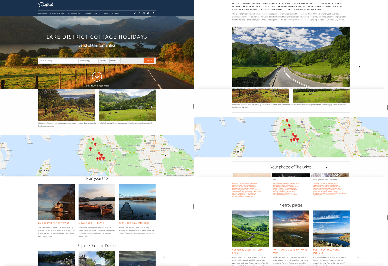
The problem: The Snaptrip website lacked inspirational guides to the UK for users who are at a very early stage of the holiday booking process and don’t know where they want to go.
The solution: I carried out a through competitor analysis and content gap analysis of the Snaptrip site. From this, I was able to list our content types that were missing from our site. My team and I prioritised the content types and drew out a series of wireframes that were refined by our designer. I then built the designs in WordPress utilising a new custom post type called “Travel Guides”. My team and I sourced images and created accompanying copy to build a rich page that would inspire the user to choose the destination for their trip.
The outcome: These pages perform very well in regards to traffic referred from our marketing emails and organic traffic. The bounce rates are impressively low and we see most users continuing to browse the site using one of the inline content links. They also tested well in lab-based user testing which I oversaw.
