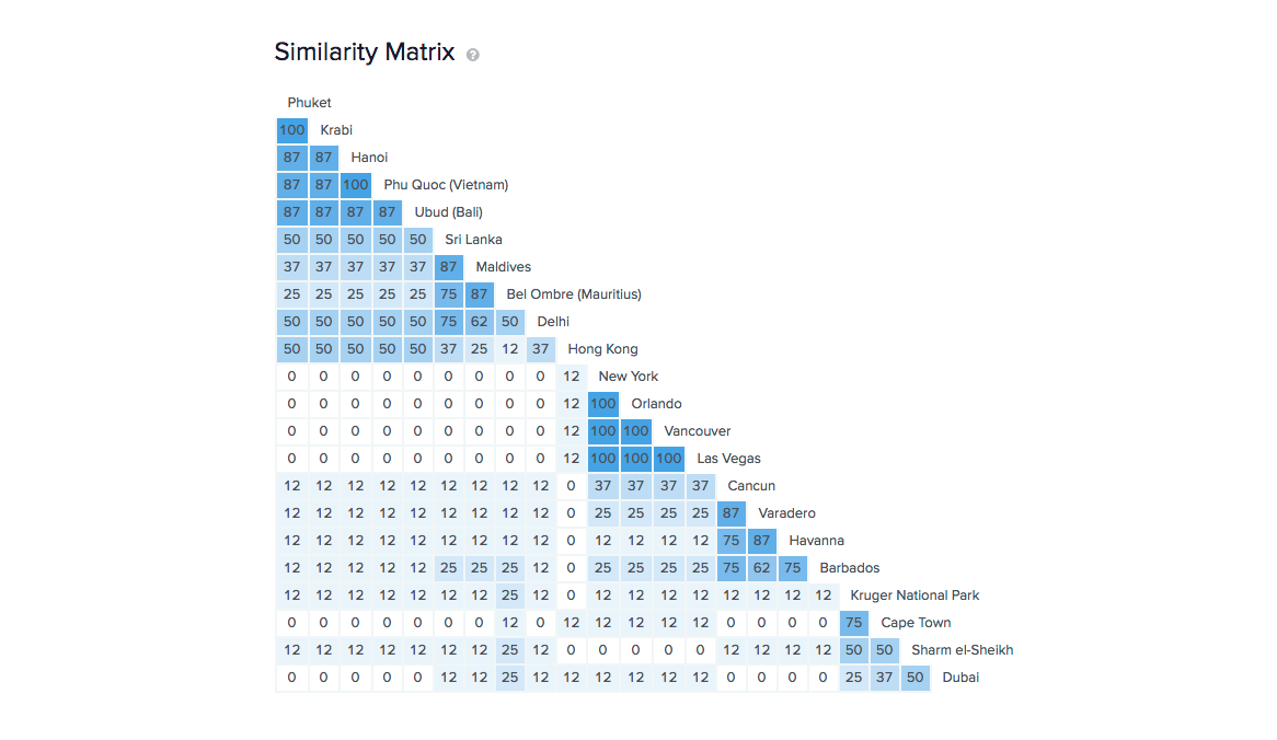
Problem: Geography is simple, right? Wrong! When we came to design the geographic structure of the Hayes and Jarvis website it soon became clear that geography can be cut lots of different ways. Even the definition of the continents was more complicated than I’d ever realised!
Solution: I started with a continental model that blended the one use in our printed brochures with a more standard model. I stuck to simple political geography for my initial map before running a series of tests in OptimalSort.
Outcome: We used the flexibility of our CMS to create a structure that bends the rules to suit the user. For example, it turns out the best place for Egypt is in Africa and the Middle East because an equal number of users look for it in each place. It was an important lesson to learn that IA doesn’t always have just one answer.
